Whether you love it or hate it or even want it, the new Marketo UI is officially here.
If you’re one of the lucky ones, your rep gave you a heads-up and you could mentally prepare for the change. Alas, if you were one of the unlucky ones, you simply opened up your instance one day to a not so fun surprise.
For many of us Marketo power users, our brains operate on a certain level of autopilot within the software. We know exactly where to click to find what we needed or how to glean critical information from the Marketing Activities tree at just a glance. But with the new UI, our Superman Marketo powers have been briefly turned back to Clark Kent.
So what now? The first step, as most MOPsPros know with any project, is information gathering and below, we’ve compiled some of the most important changes you need to know about. Then, add some time to your calendar to explore the new UI on your own and fully acclimate yourself to the changes.
First, A Little Design History:
Users have long noticed that Marketo’s interface was very dated looking. This was because the design was skeuomorphic, a trend that was popular in the early 2000s.
Skeuomorphic means that icons resembled the item they were meant to represent. Think of the trash can icon being used to represent deleting a file or a floppy disk icon being used to represent saving a file. Originally, the goal of the skeuomorphic design was to help users understand what functionality to expect when clicking on a given icon. But now, the meaning of certain icons is so ingrained that the icons no longer need to literally look like their real-life counterparts in order to convey their functionality to the user.
![]()
How did this apply to Marketo? It’s skeuomorphic design meant that each icon was very distinctive in order to represent the functionality of the icon – a mailbox was an email program, binders were programs, etc.
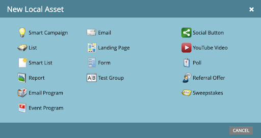
Enter the new UI. Marketo has finally caught up to the modern era of design, thanks to its acquisition by Adobe. As part of the Adobe family, Marketo must adhere to Adobe’s design standard and that standard is a flat design style.
But this transition has been rocky. The new icons are flat, uniform, gray, and, worst of all, tiny. So tiny in fact that they are even blurry in the official Marketo documentation.
![]()
For Marketo practitioners who have heavily relied on iconography to operate the software, these new icons have stripped away a lot of visual information and cues. Our ability to scan through the tree and glean information is now much more difficult because everything is a sea of squares, lines, and those frustratingly confusing green and yellow circles. I’ve never missed a lightbulb so much before.
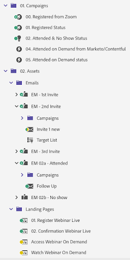
With that background, here are some tips on how to navigate the new UI:
- Slow down the first days you are using the new UI
- Consistently double-check that you are clicking on the right icon, accessing the right file, finding the right action, etc.
- Use the new tooltips to understand all the different green and yellow circles and what they represent in different areas of Marketo.
![]()
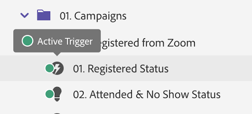
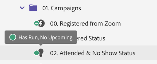
Now, Let’s Talk about the New Features
Marketing Activities Tree
Resizing the Marketing Activities tree is now a bit more finicky. If you expand the tree, it will snap back to its regular size the next time you log in. This is frustrating because the default size is too small to view the folder structure for most instances.
Drag and drop
Perhaps the most painful change is the loss of drag and drop.
However, the drag and drop functionality was not compatible with Web Content Accessibility Guidelines. These guidelines help make the web accessible for users with disabilities that may be accessing the web through a screen reader or other assistive technology, so removing this functionality actually makes the platform use more egalitarian.
Marketo has replaced the drag and drop functionality with a move feature to make Marketo more accessible. So now, users need to right-click on an item and select Move in order to move an item to a new location.
Side note: Early on in the rollout of the Marketo UI, the Move functionality did not allow users to move items to an Archive folder. This has since been fixed.
Going forward, Marketo has reported that adding the Drag and Drop functionality back into Marketo is part of their 2021 roadmap.
Pod Numbers
Your pod number is now gone from your main URL and has been replaced with your instance’s munchkin ID. This change has drawn some raised eyebrows since having the munchkin ID is not as helpful as the pod number. If you have any idea why this change would be an improvement, drop us a line!
Thankfully, if you’re looking for your pod number, you can still find it whenever you’re editing a landing page, form, or email. However, given that Marketo is now a hodgepodge of the old UI and the new UI, it’s unclear how long this information will be accessible this way.
Sorting Symbols
RIP the ~ and RIP Etumos’ preferred way of setting up folders. The ~ (called a tilde) no longer pushes items to the bottom of the folder structure. Adobe recently confirmed that the _ is now the icon to use to push items to the bottom.
According to Marketo expert, Sanford Whiteman, “It was only a matter of time! In what we developers call “lexical order,” the tilde (~) always sorts after the letters A-Z, a-z, and 0-9. That’s why it’s the typical best guess to force something to the end. (In that same primitive order, the underscore (_) sorts to the middle, between uppercase and lowercase letters!)
But once an app introduces a customized sort order to improve the UX, you can no longer rely on that guess — and have to ask the vendor if there’s a special exception.
Currently, Etumos has verified that the following order works for users with a standard US keyboard: – , ; : ! ? . ‘ ” ( ) [ ] { } @ * / \ & # % ` ^ + < = > |~numerals letters _
For users with any other type of keyboard and using non-standard English characters (kanji, Cyrillic, foreign currency values, etc.), we recommend running your own tests to see what works. We’ll be working on a new recommended way to structure folders and begin pushing that out to our clients soon.
Global Search
Say goodbye to getting lost in your maze of folders and say hello to a speedy new Global Search functionality. Now users can search across their entire instance (yup, across Marketing Activities, Design Studio, AND Database) and drill down using a variety of nifty filters. This is one update that I’m very excited to be using more in the future.
Side note: Early on in the rollout of the Marketo UI, the Global Search functionality was another update that was buggy but has now been updated.
Top Nav Bar
The Marketo Superball in the top left-hand corner is no more! Now, users can access all the main areas of the software via the top navbar. One result of this shuffle is that the Community shortcut is more hidden under the Help menu, which is really unfortunate since Marketo’s lively community is an incredible resource for users.
![]()

Another critical thing to note – any additional modules like SEO won’t be accessible via the top nav bar like they used to be under the Superball. Users will have to head back to the home screen to access them.
![]()
Design Studio Shuffle
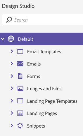
File this change under “unnecessary” as the new UI has now shuffled the order of the Design Studio folders and split out the Emails and Landing Pages folders into distinct folders for assets and templates. The folders are also now alphabetized. As far as we can tell, this only makes it more confusing for seasoned pros who were extremely used to having the folders in a specific order.
Conclusion
Our assessment at this time is that this update can be described as the right intentions went awry. They attempted to modernize the software but failed to provide enough concrete benefits to outweigh the severity of all the changes.
In the coming weeks and months, Marketo is actively working to fix what they perceive to be the biggest issues with the new UI so keep your eyes peeled for new releases and announcements. You can use the Feedback button in the new top nav bar to share your thoughts and the Marketo reps are responding to comments.


